Examples
Each example is a complete .arch document, shown as the diagram Archer draws from it. Nothing is drawn by hand: the images come from the same renderer as share links and README embeds, straight from the source. View code shows that source, and Open in sandbox loads it into the editor to change however you like, no account needed. Nothing there is saved.
The first three have no layout block. That is how agents write Archer, and those diagrams are the app's auto-layout. The last one is a whole product laid out by hand, so it shows what the canvas writes once you arrange things yourself.
- 1Link Shortener · components, types, connections, labels
- 2Billing Service · descriptions, source links, payloads
- 3Support Desk · shapes
- 4Coffee Shop · icons, colors
- 5Photo Sharing · planes, planes inside planes
- 6Food Delivery · nesting, paths, opening a component
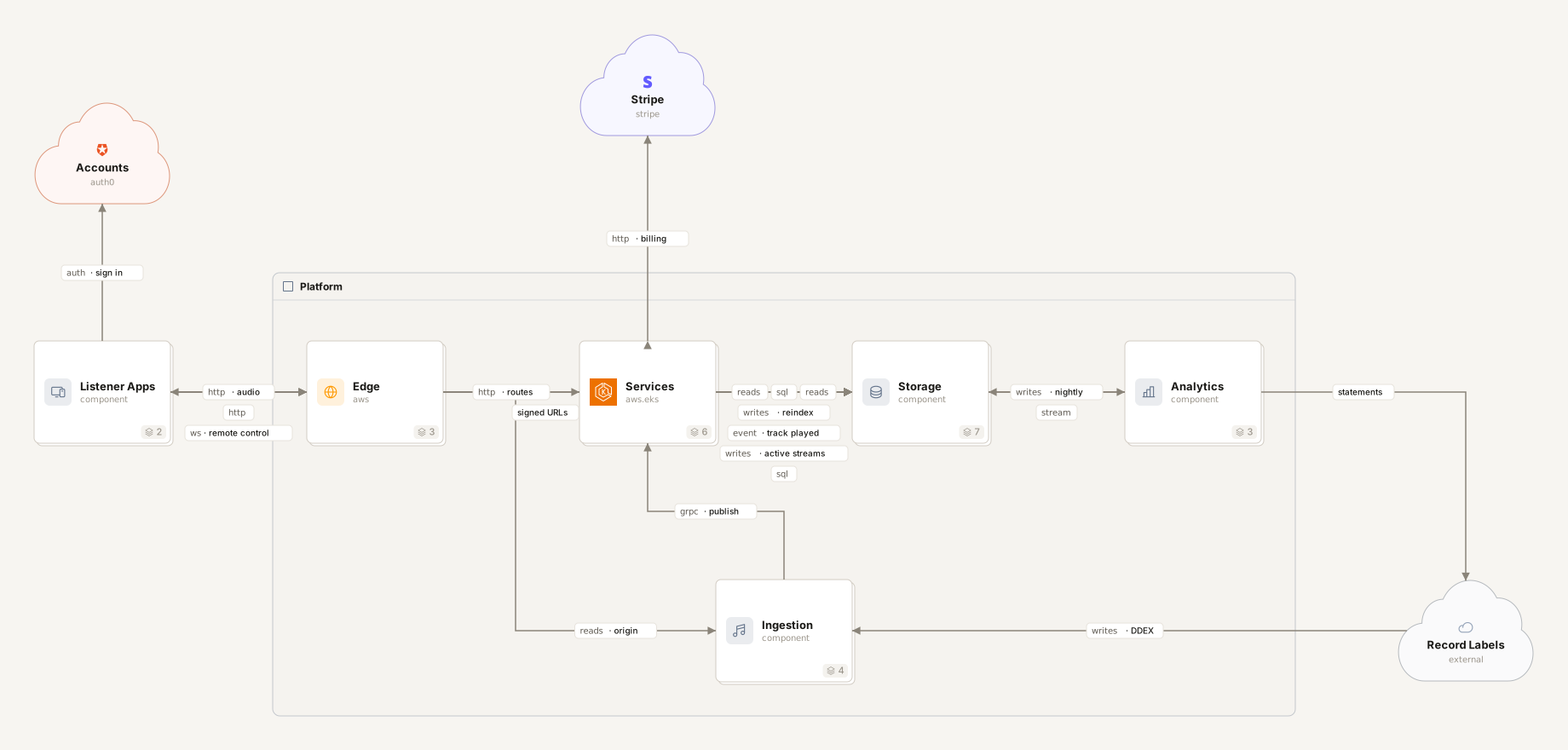
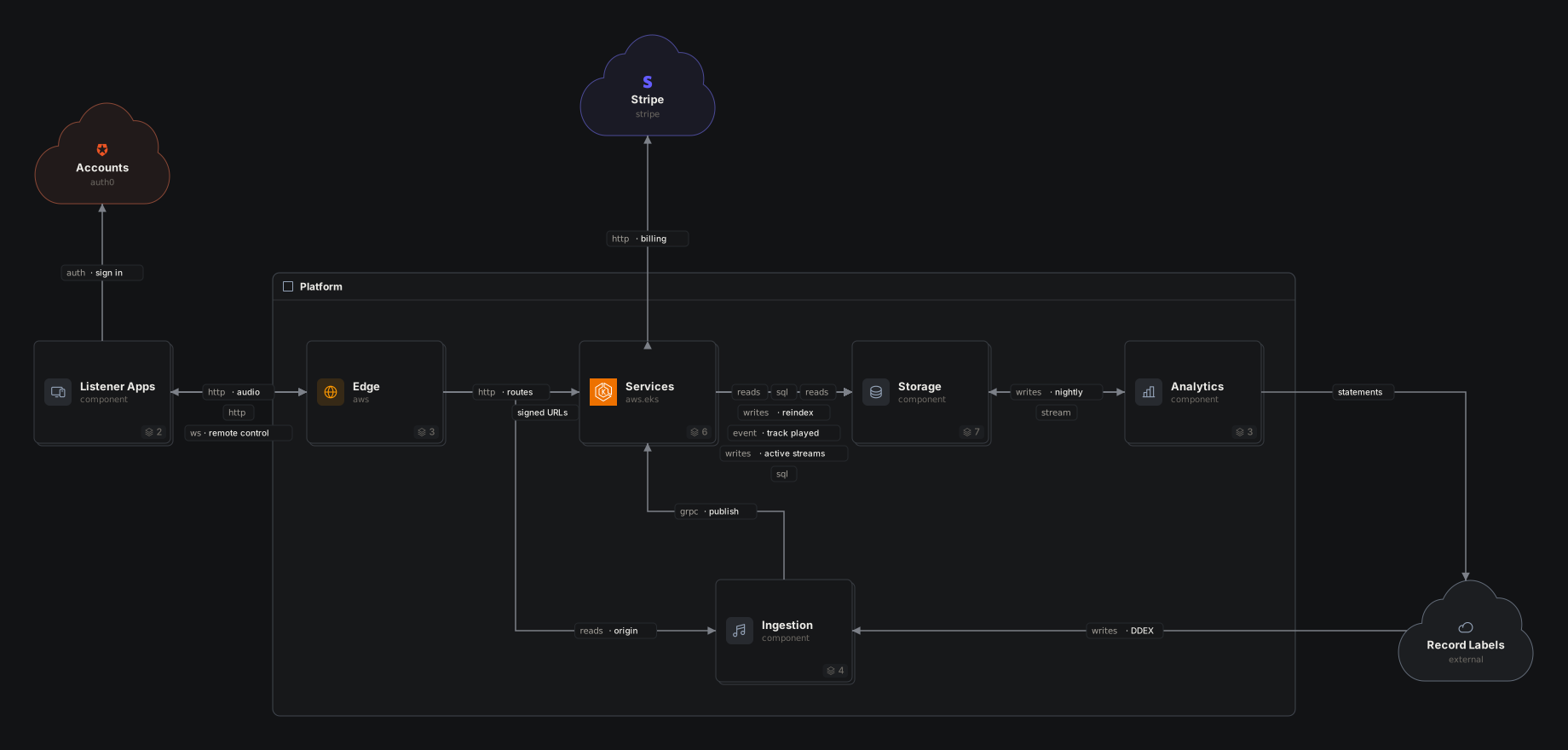
- 7Music Streaming · nesting a big system, planes and nesting together, planes inside a component, arrow kinds, connection payloads, the layout block
Link Shortener
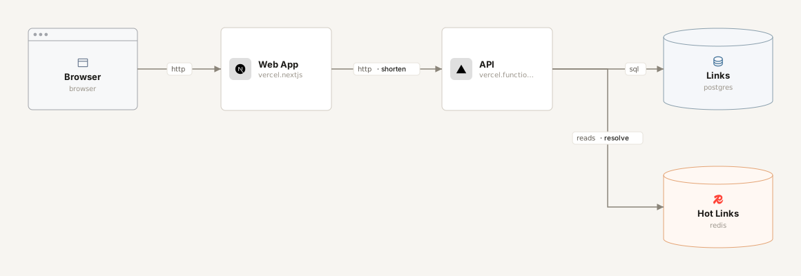
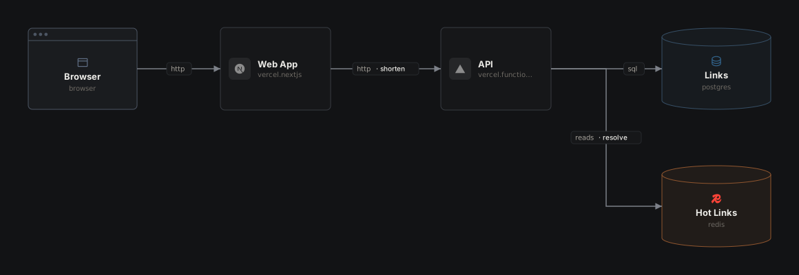
The smallest useful document: a header, a few typed components and the connections between them. A @type picks the icon and color, a shape the outline; a label says what travels on an arrow. A color overrides the type's: here orange marks the hot path, the cache most requests stop at.
Billing Service
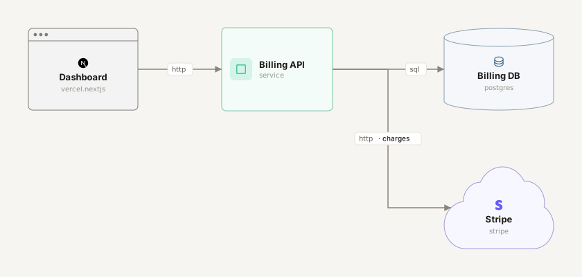
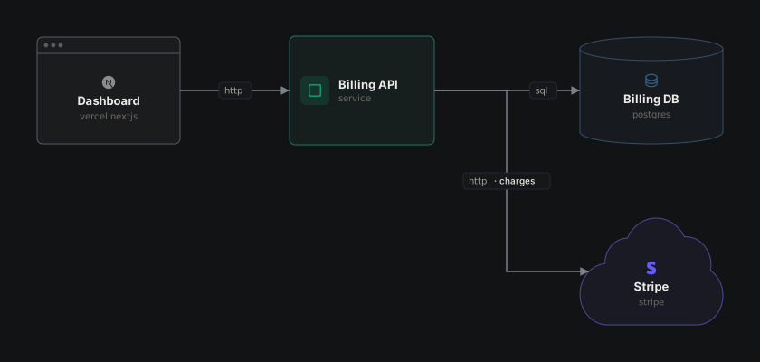
A component body holds a desc, src pointers into the codebase (a line for each place it lives, a folder, a file or a URL), and named payloads. json, yaml and table payloads are validated; markdown is freeform. The editor shows them in the detail panel, and agents read them as the spec.
Support Desk
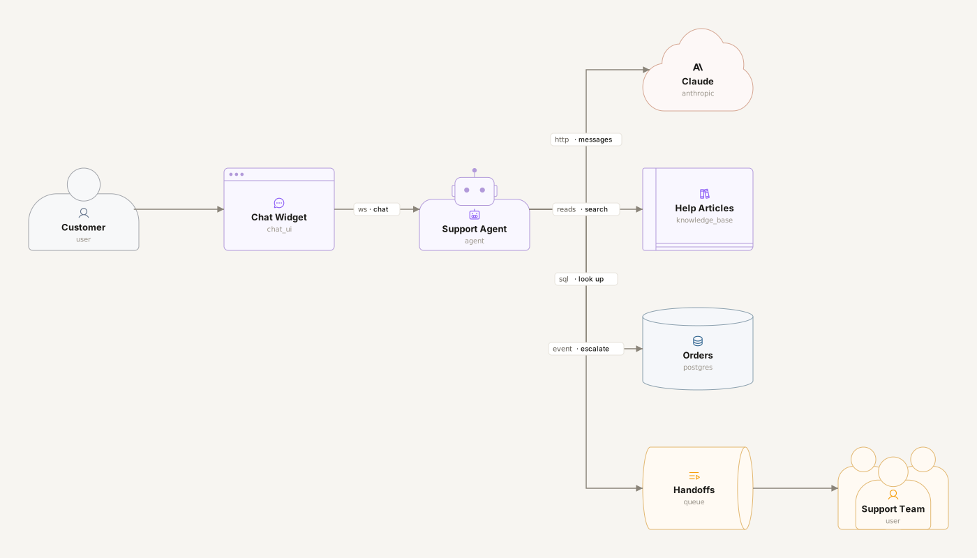
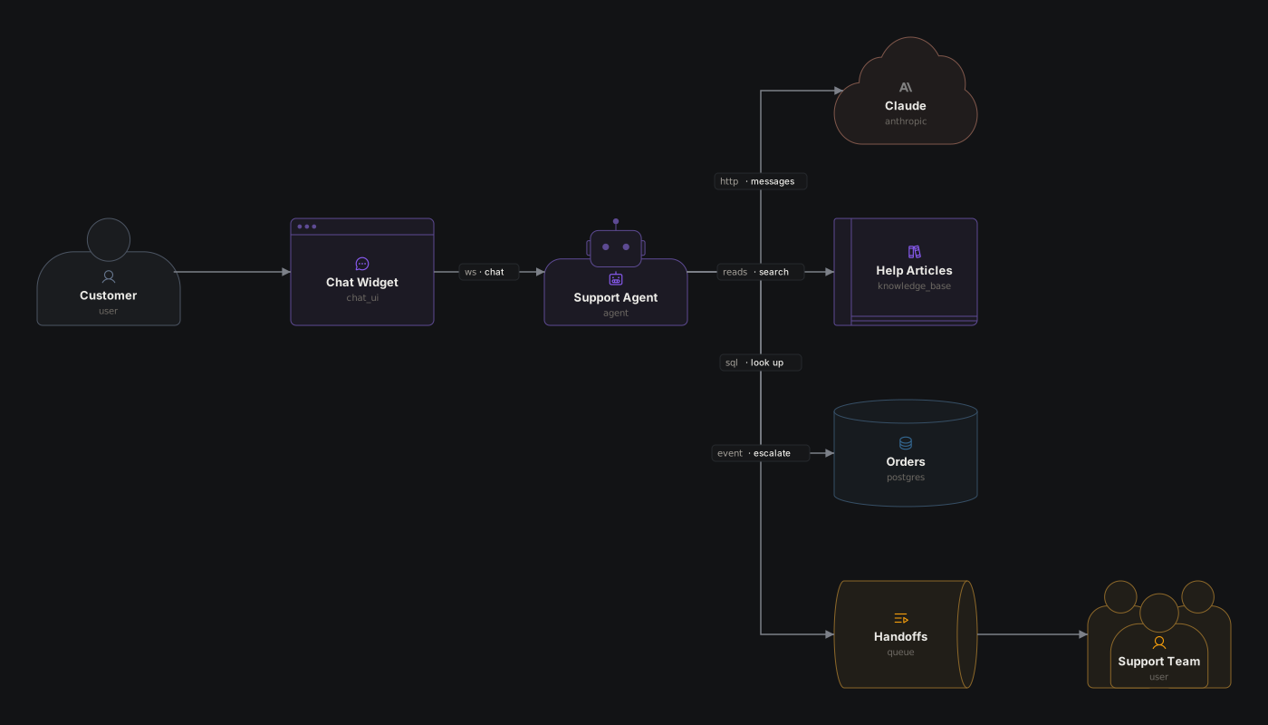
A shape in a component's body draws it as what it is: a person for the customer, people for the support team, a robot for the agent, a cloud for the model provider, a book for the help center, a cylinder for the database. The type still picks the icon and color inside the outline (an icon and a color can change them: amber marks the way to a person), and anything without a shape stays a box. Shapes are for readers; an agent implementing the document can ignore them.
Coffee Shop
An icon in a component's body picks the icon it shows: any Phosphor icon by its snake-case name (coffee, receipt, device_tablet) or one of the catalog's (database, queue). An untyped component shows no icon until it picks one, so an icon is the quickest way to say what something is without a type. On a typed component it replaces the type's icon and keeps its color, like the book on the Postgres menu. A color does the same for the color: a palette name (amber) or any "#rrggbb", like the coffee brown of the barista's screen. The rest go by role, as the agent guide suggests: the customer and their devices are sky, the Orders service blue. Icons and colors are for readers; an agent implementing the document can ignore them. list_types lists every icon, and the editor's Icon picker searches them.
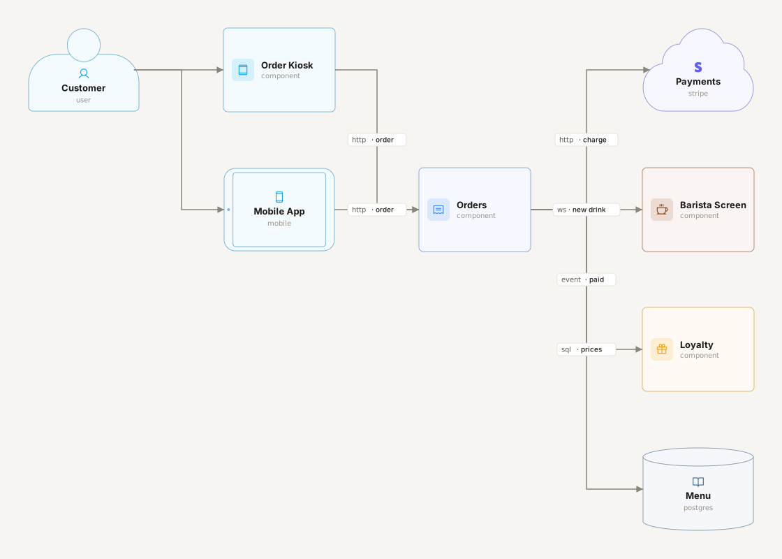
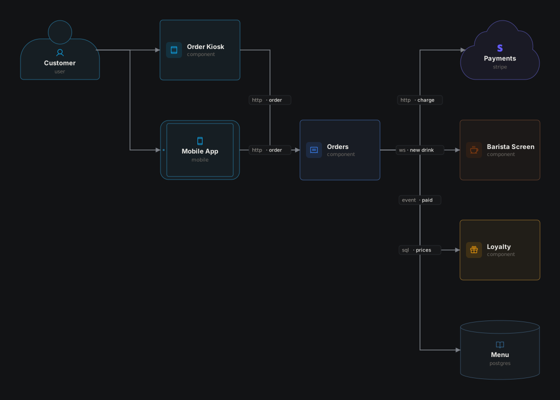
Photo Sharing
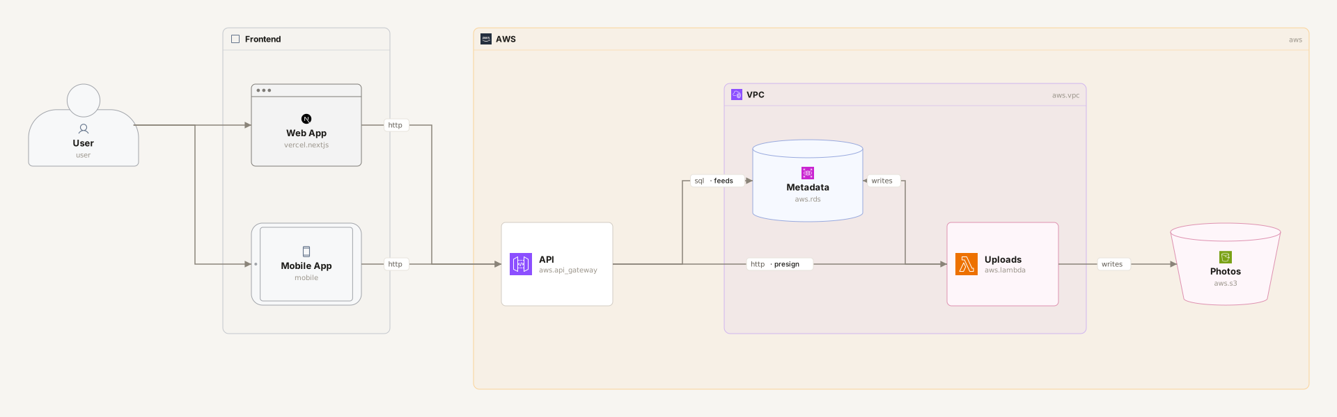
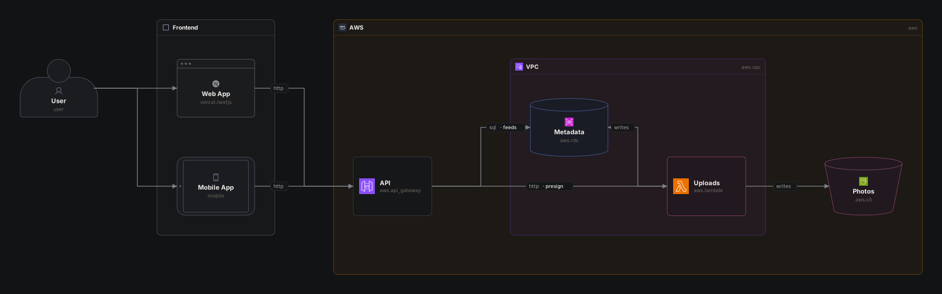
A plane is a titled region of the canvas, a background you put components on: the user's devices on one, the AWS account on another, and a VPC inside that. Planes are only for the reader. They don't change a component's path (api, not cloud.api), connections never attach to them, and like a component a plane can take a @type and a desc. Colors cut across planes: the upload path is pink wherever it runs.
Food Delivery
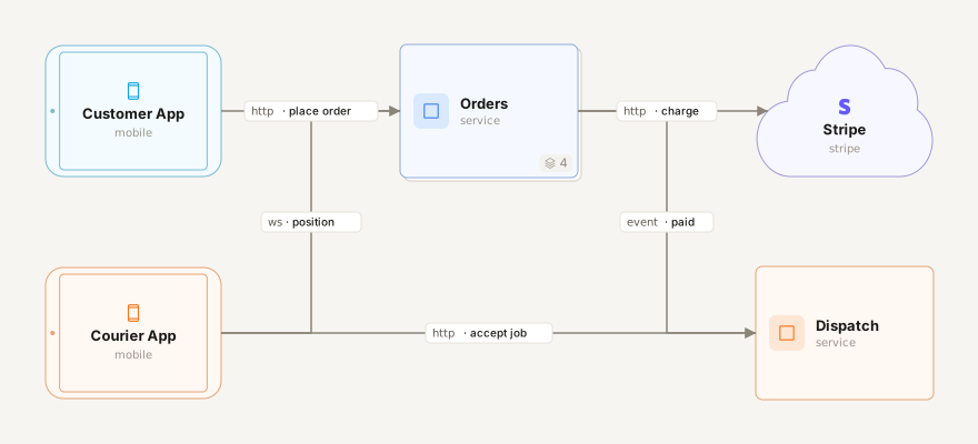
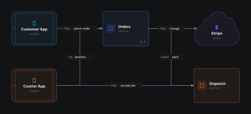
Any component can hold components. Orders owns its API, checkout, tracker and database: on the canvas it's one box with a count of what's inside, and opening it shows those parts, with whatever outside they connect to along the edges. A path reaches a nested component (orders.checkout), and a connection can join one or the whole component (app -> orders). Colors go by side: the customer's app is sky, Orders and its parts blue, and the courier's side orange.
Music Streaming
A whole product in one file that still reads at a glance: listener apps, the platform we run, and the outside world around it. The platform's five parts (edge, services, storage, ingestion and analytics) sit on one plane, and each is a component holding its own pieces, so the top level is nine boxes and ten lines, and opening one shows the rest. Opening Services shows all six services, on a plane per Kubernetes namespace: a plane inside a component is a region of its own canvas, and the services on it are still services.playback and friends. All three arrow kinds appear: ->, <-> for the remote-control socket, and -- for the signed URLs Playback and the CDN agree on. It was laid out by hand, so it ends with the layout block the canvas writes when you drag and resize. Agents may read that block to see the diagram as drawn, but never implement anything from it, and write it only when asked to arrange the diagram. Where the money flows, in and out, is emerald.